Journal · 20 Jun 2026 · 6 min read
Keeping Brand Consistency Across Every Decoration Method
By Kwai Lekr Studio
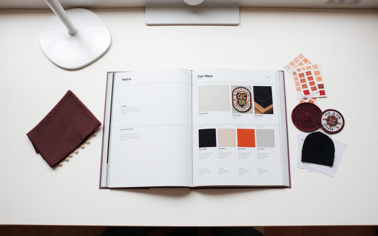
Your logo lives on cotton, steel, wood, leather and vinyl at the same time. Here's how to keep it recognisable across every substrate.
Brand Consistency Across Decoration Methods
A logo that looks perfect on your website has to survive translation onto embroidered thread, engraved wood, printed vinyl and screen-printed cotton — each with its own physical constraints.
Build a decoration-ready brand pack Beyond the standard style guide, supply the studio with:
- Vector master (.ai, .svg) with fonts outlined.
- Pantone (solid coated) references — not RGB or hex.
- One-colour variants for laser, embroidery and deboss.
- Reversed (white/knockout) variants for dark substrates.
- Minimum-size rules per substrate (embroidery: 5mm strokes; laser: 0.3mm; screen: 1mm).
Colour matching in the physical world RGB is emissive; ink and thread are reflective. A perfect on-screen match is impossible — pick your battles:
- Uniforms: match Pantone thread and stock the reference for re-orders.
- Hard goods: use tonal or single-colour marks where possible.
- Print collateral: use CMYK-safe brand colours from the outset.
Pre-flight checklist for every job 1. Vector artwork received and reviewed. 2. Pantone confirmed for every colour. 3. Substrate confirmed and matched to decoration method. 4. Placement dimensions confirmed (mm from fixed reference). 5. Sample or digital mock-up approved before production.
We run this checklist on every brief — it's the single biggest reason our repeat clients see the same mark, at the same weight, across every touchpoint.
AI Deep Dive
brandconsistencystrategy